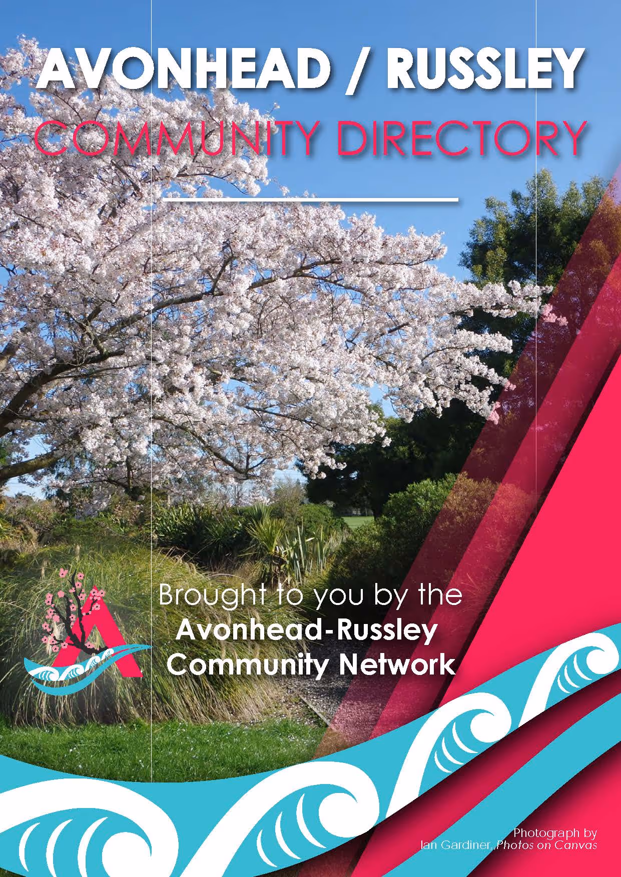
Avonhead-Russley Community Network

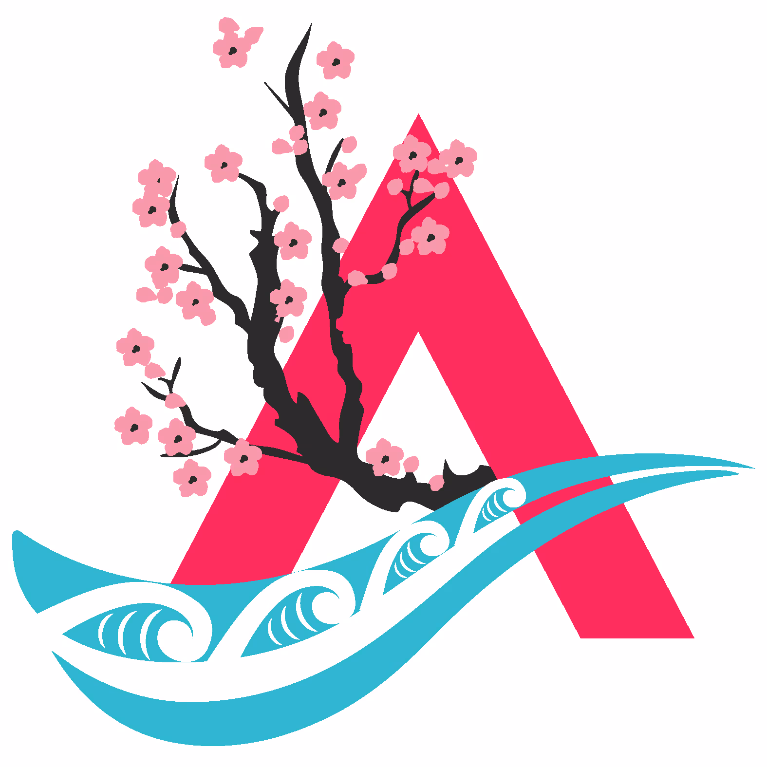
Project Description: Avonhead-Russley Community Network Logo
Client: Avonhead-Russley Community Network
Project Overview:
Before work could begin on the Avonhead-Russley Community Directory, a brand identity and logo for the organizing team had to be developed in order to promote confidence for potential viewers to the directory. and provide a visual identity to move forward with.
Design Challenge:
The branding had to be representative of the wider community and the area of Avonhead & Russley. As well as be sensitive and inclusive to Māori culture and associations with the area.
Creative Solution:
Working alongside Damian Mackie at the Whakaraupō Carving Centre and Trust in order to involve an expert perspective and learn the cultural identities and histories about the area and their wider involvement with wider Otautahi, a logo was developed that speaks to and honors multiple aspects, cultural significances, and communities in Avonhead & Russley
Key Ideas & Korero:
- The two arms of the head of the Ōtakaro awa and it’s past use as a delta, being able to launch waka and paddle from one side of Otautahi to the other before colonial settling.
- Avonhead/Russley area being known in Māori as Ngā Puna Wai: ‘many spring waters’ Koru are used here to signify the many springs and creeks in the area. Also being representative of the migration of Hapu to food souces, which were abundant in the area.
- Inclusion of raperape ‘ripples of learning’ to reinforce the idea of motion and how Avonhead shares with the wider communities, and the history the area and of Ōtakaro awa of being used as important launching point for transit out to wider Otautahi.
- Arms of the ‘A’ are representative of two arms coming together, one of Tangata Tiriti and the other of Tangata Whenua, two peoples uniting.
- Cherry Blossoms: Iconic to Avonhead, they signify growth, renewal, and optimism, reinforcing the community’s bond with nature.
- The colours draw from local schools (Russley, Avonhead, Westburn, and Merrin), blending red, blue, and green.
Special thank you and tēnā koe to Damian Mackie from the Whakaraupō Carving Centre Trust for his input on the design and his teaching on the cultural aspects surrounding it.
Project Results:
The logo became the visual identity for the group and for the wider directory project that followed.
Project Showcase
Explore the creative journey of each project.

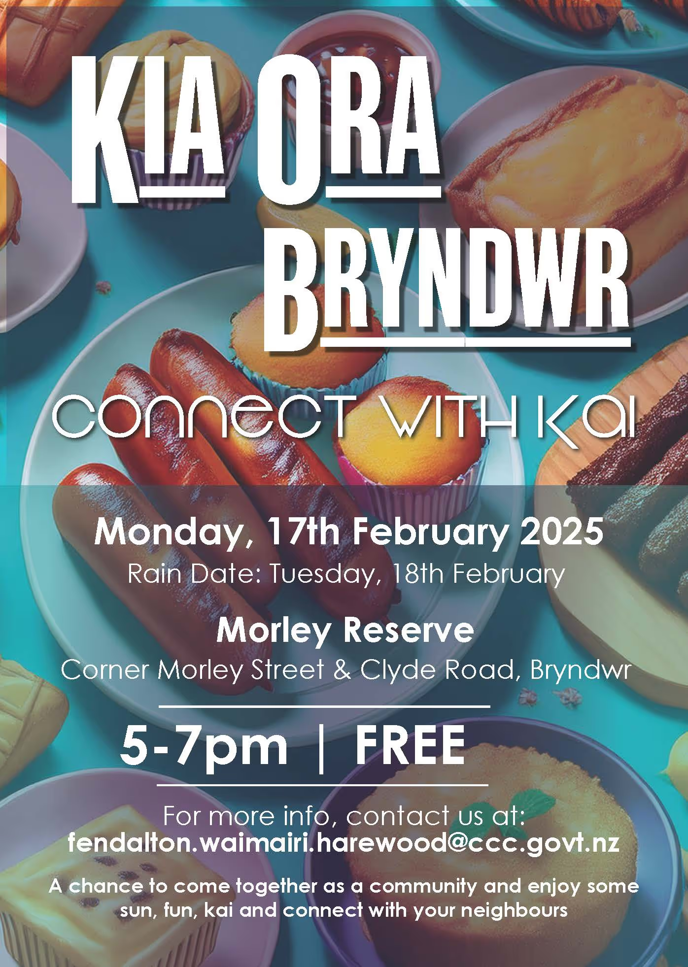
"Daniel has been an incredible creative partner on both the Avonhead/Russley Community Directory and Kia Ora Bryndwr advertising projects. His design work, from the eye-catching directory layout to the engaging AO boards and posters, has helped bring community initiatives to life. He brings both professionalism and heart to every project. An absolute pleasure to work with. 😊"

SiliCAN

St. Christopher's Anglican Church
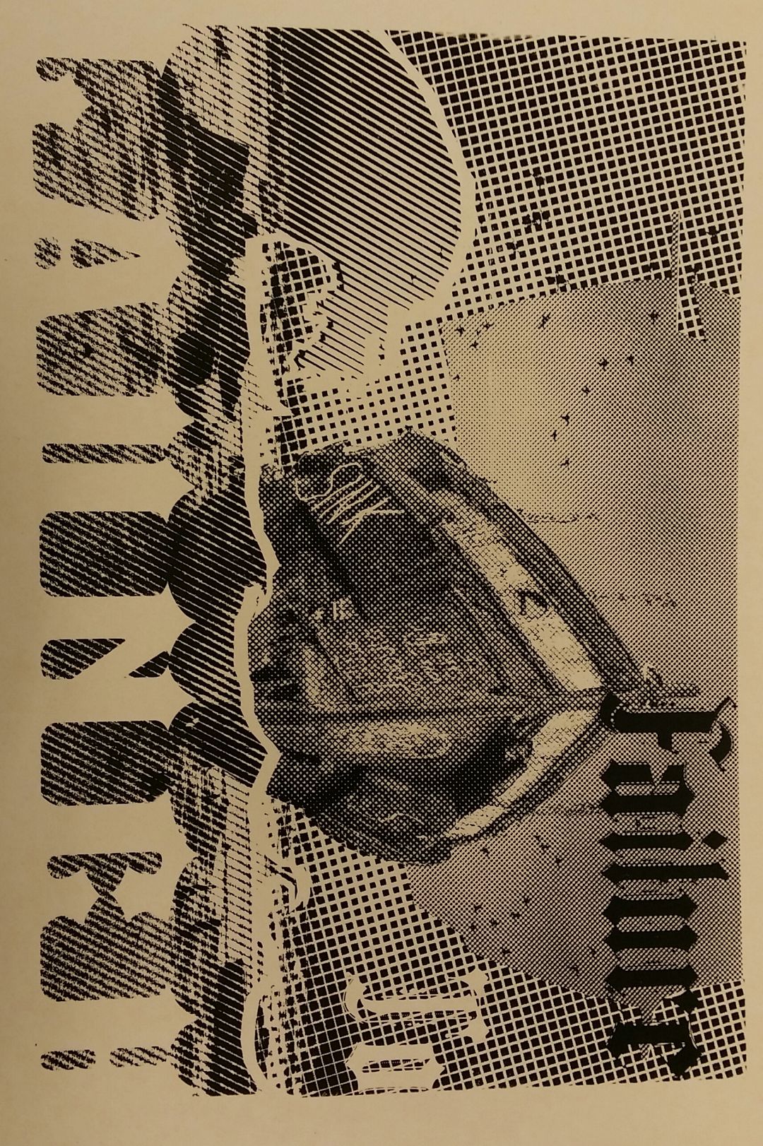
Failure to Launch (2017)
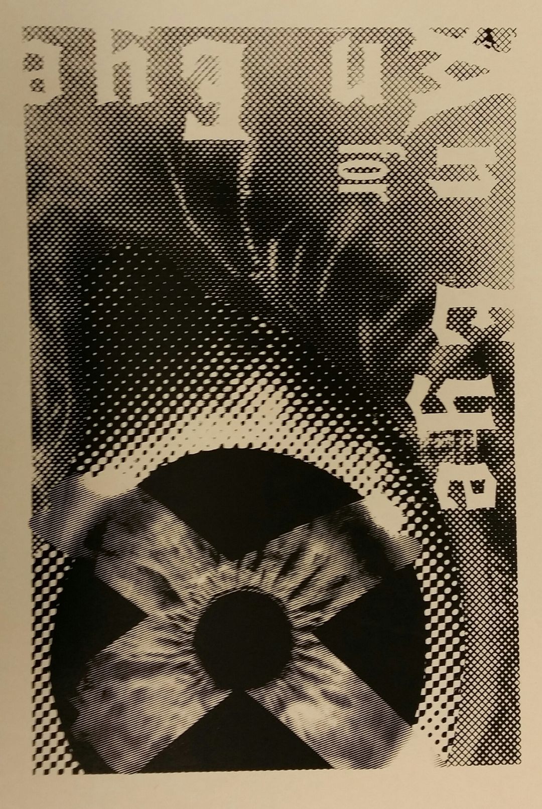
Eye for an Eye (2017)
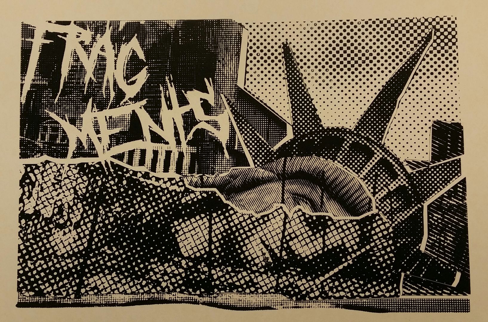
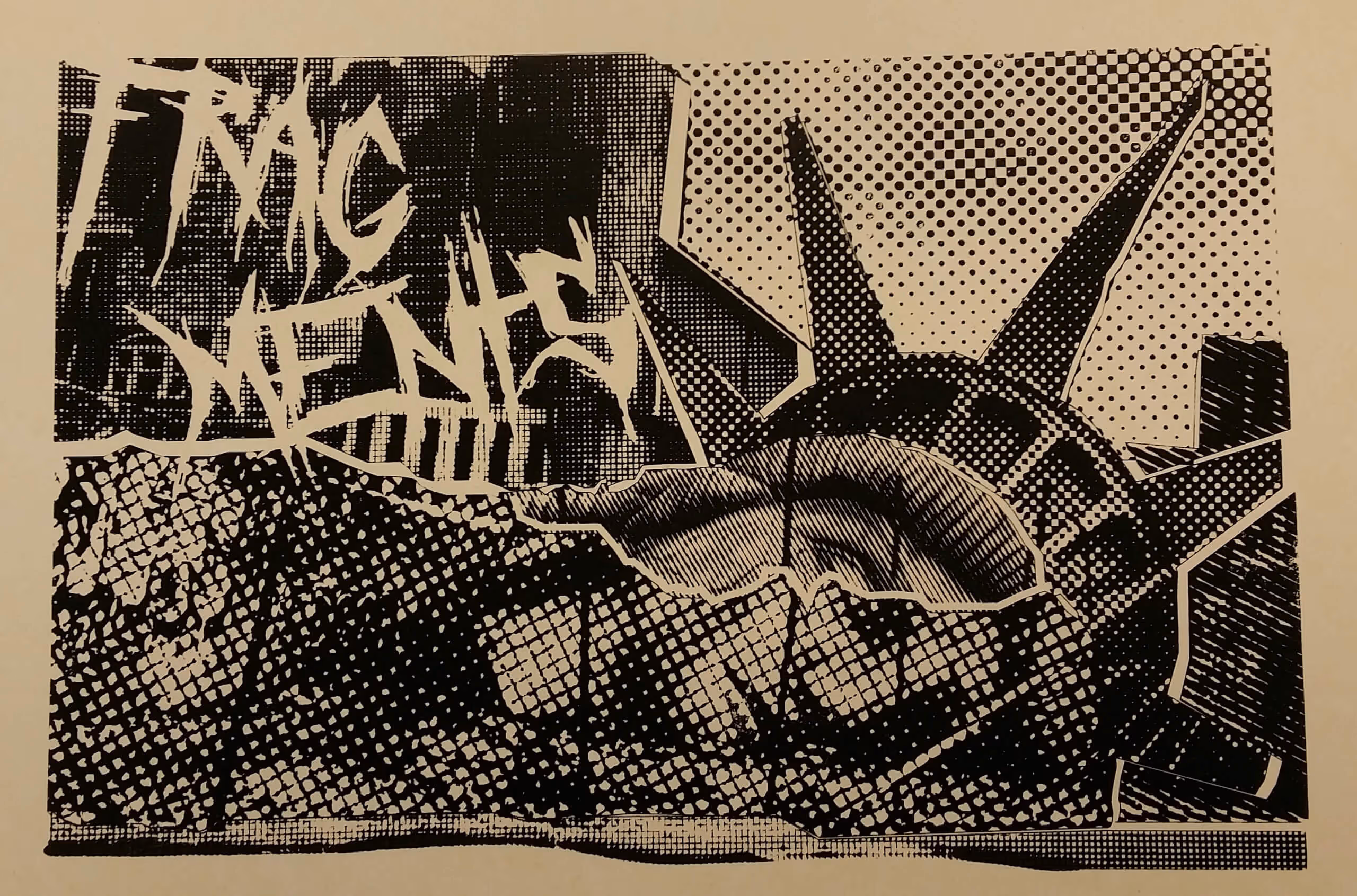
Fragments (2017)

Jan-Pro
Rotorua Baptist Church YOUTH

One Tidy Garden
The Doctor Tiling NZ
Steve Thomas - SHARE Advisor
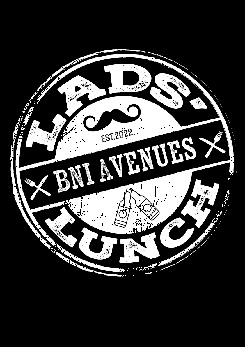
BNI Avenues

Scuffd.co.nz
Summerset Christian Fellowship Group
The Youth Hub Trust
Sonya Pegg
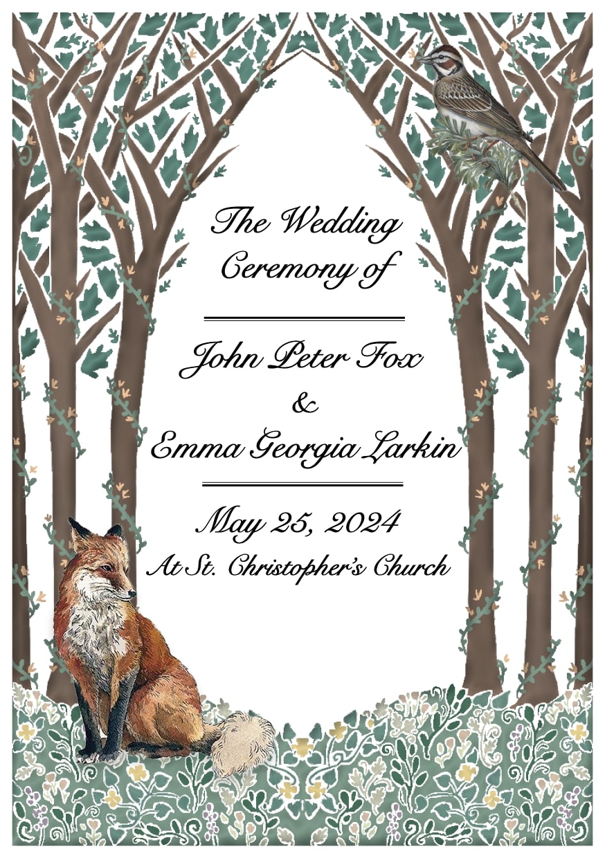
Emma & Rev. Dr. John Fox
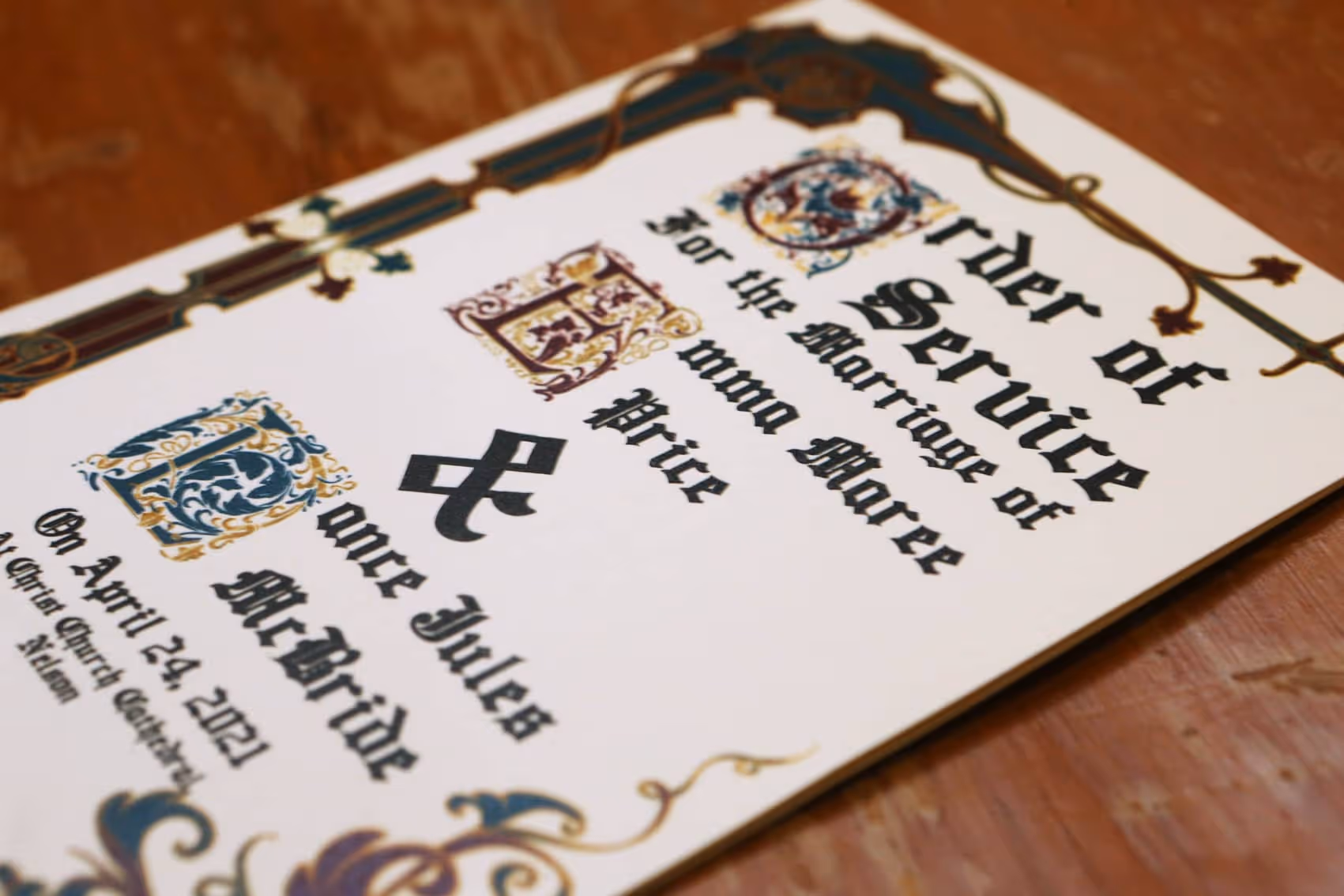
Emma & Lance McBride

Christchurch Rotary Club
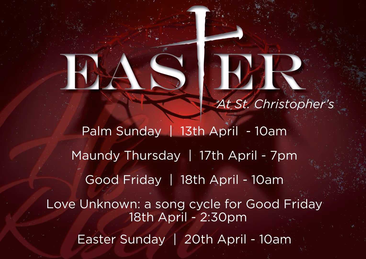
St. Christopher's Anglican Church

St. Christopher's Anglican Church
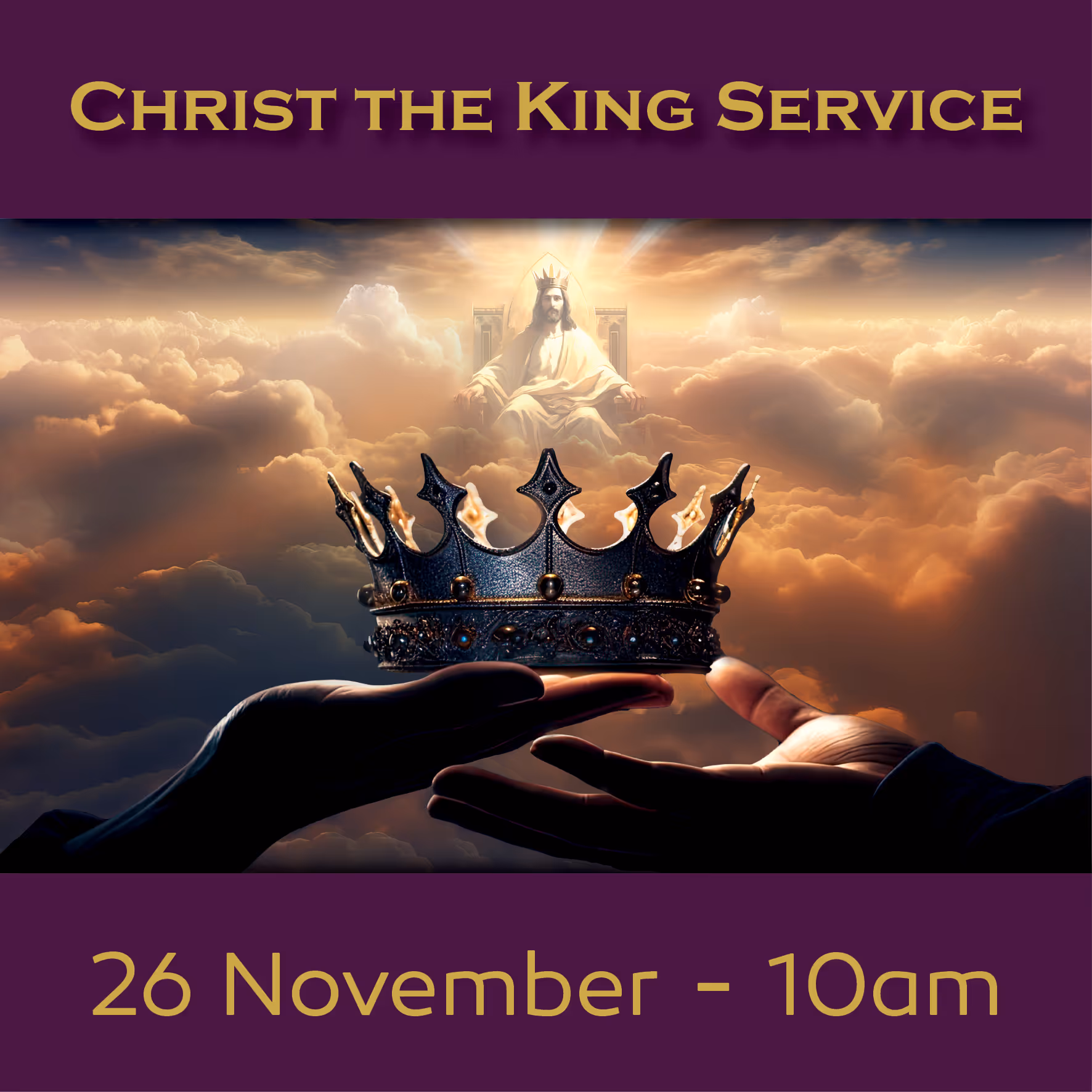
St. Christopher's Anglican Church

St. Christopher's Anglican Church

St. Christopher's Anglican Church
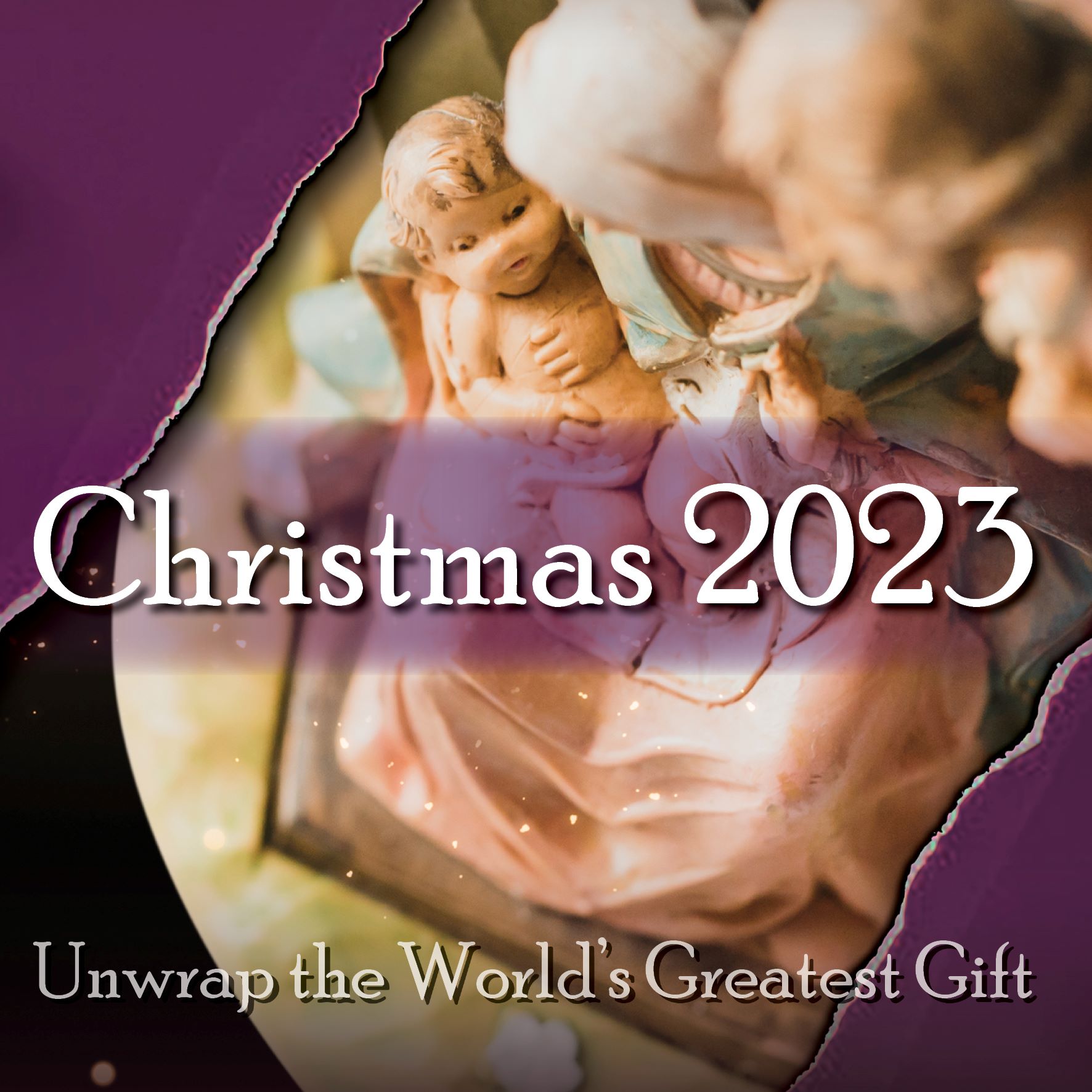
St. Christopher's Anglican Church

St. Christopher's Anglican Church
St. Christopher's Anglican Church
.jpg)
Ōtamahua / Quail Island Ecological Restoration Trust
.jpg)
Ōtamahua / Quail Island Ecological Restoration Trust
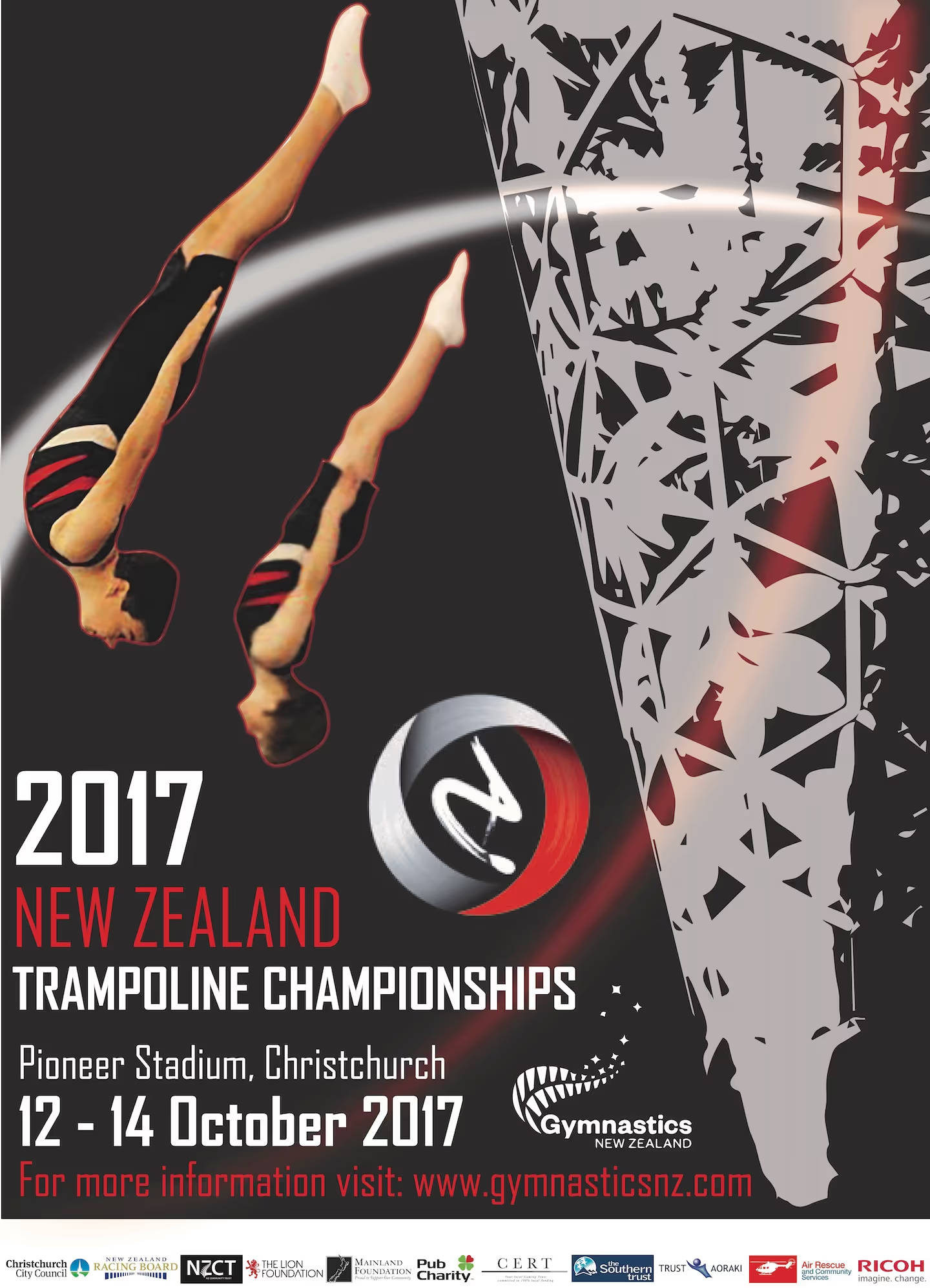
Gymsports in Canterbury Charitable Trust
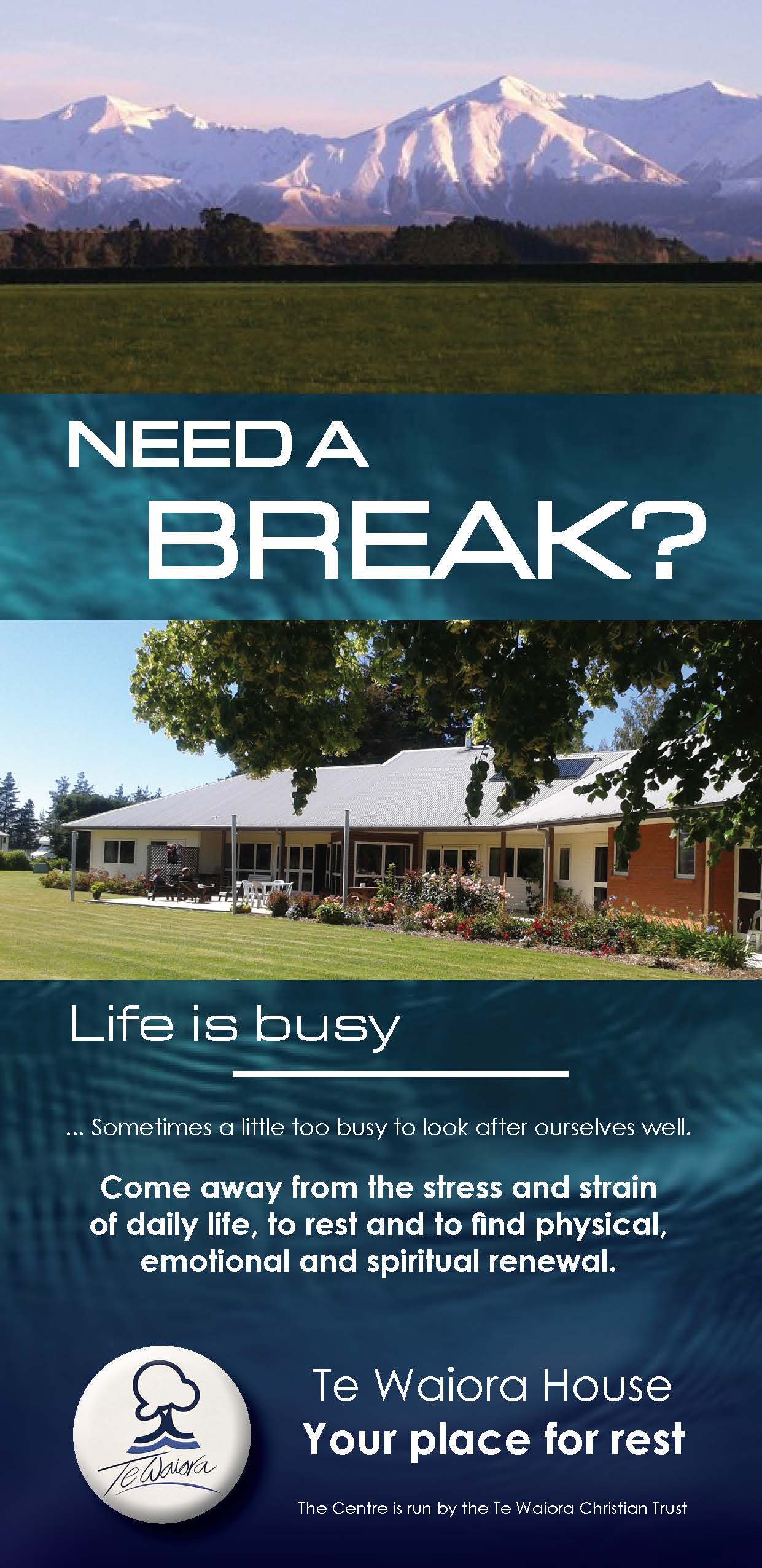
Te Waiora Trust
Christchurch City Council
Avonhead-Russley Community Network
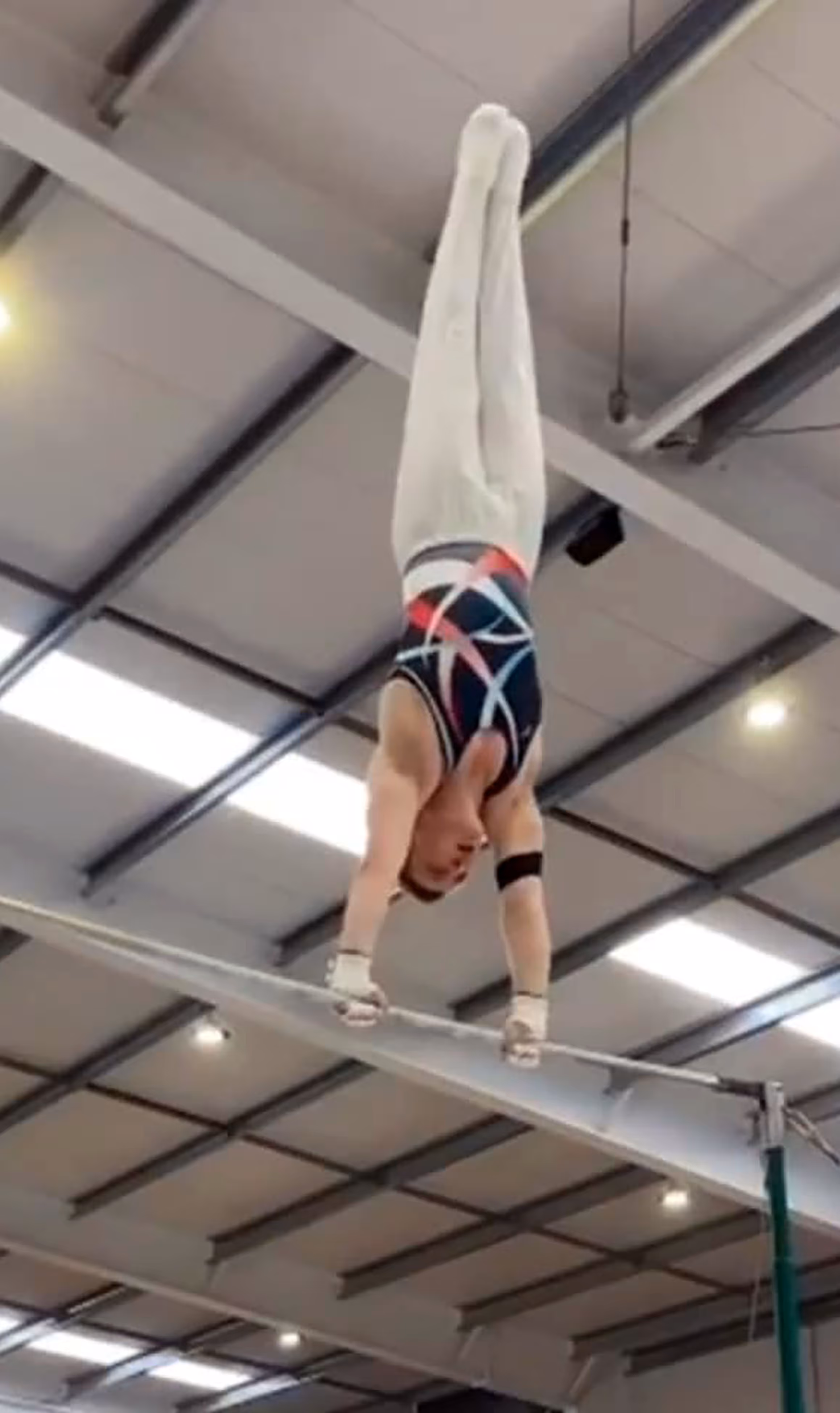
Christchurch School of Gymnastics
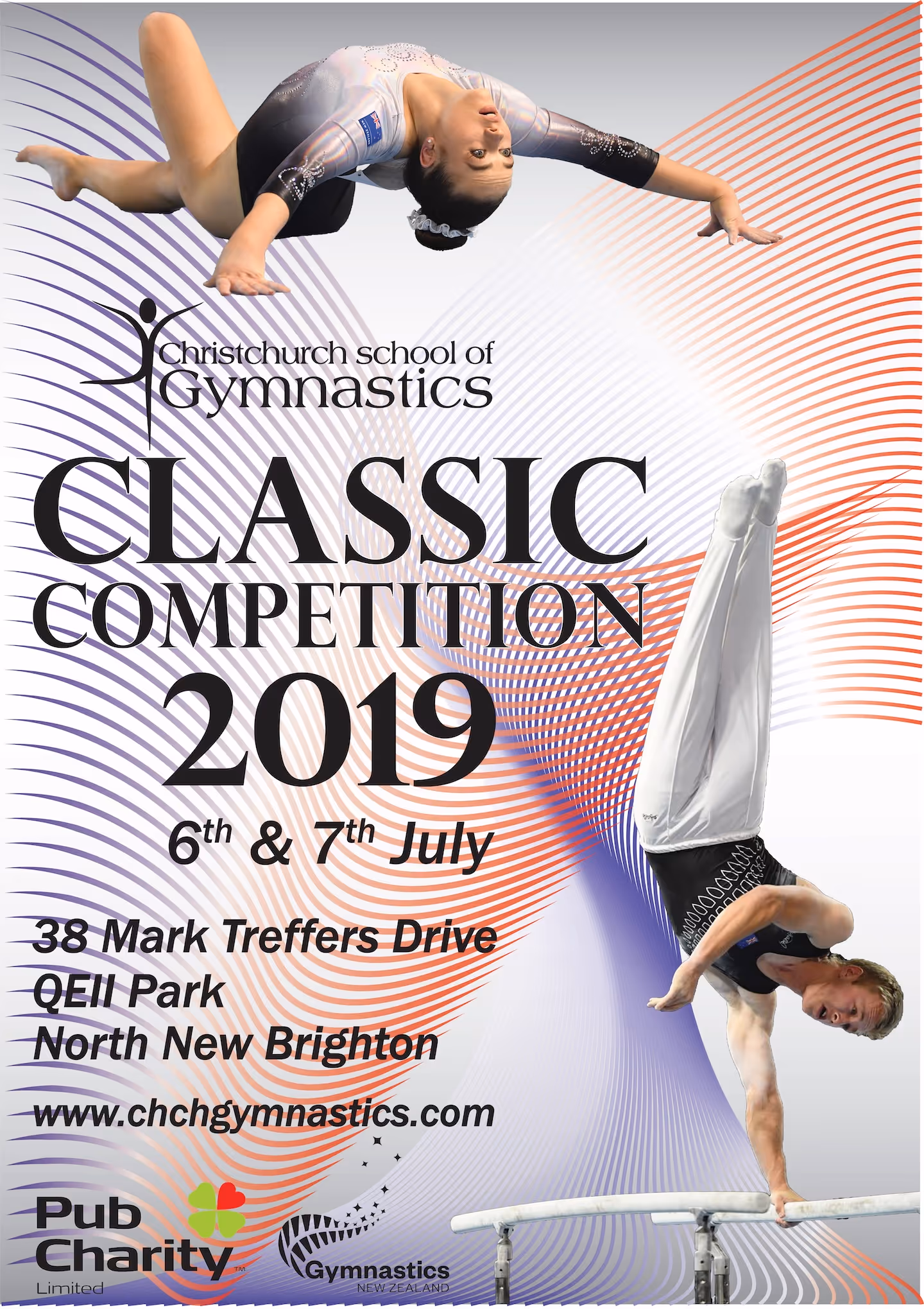
Christchurch School of Gymnastics
Christchurch School of Gymnastics
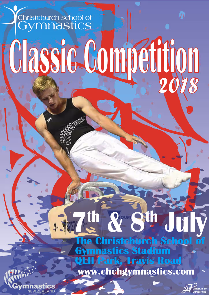
Christchurch School of Gymnastics
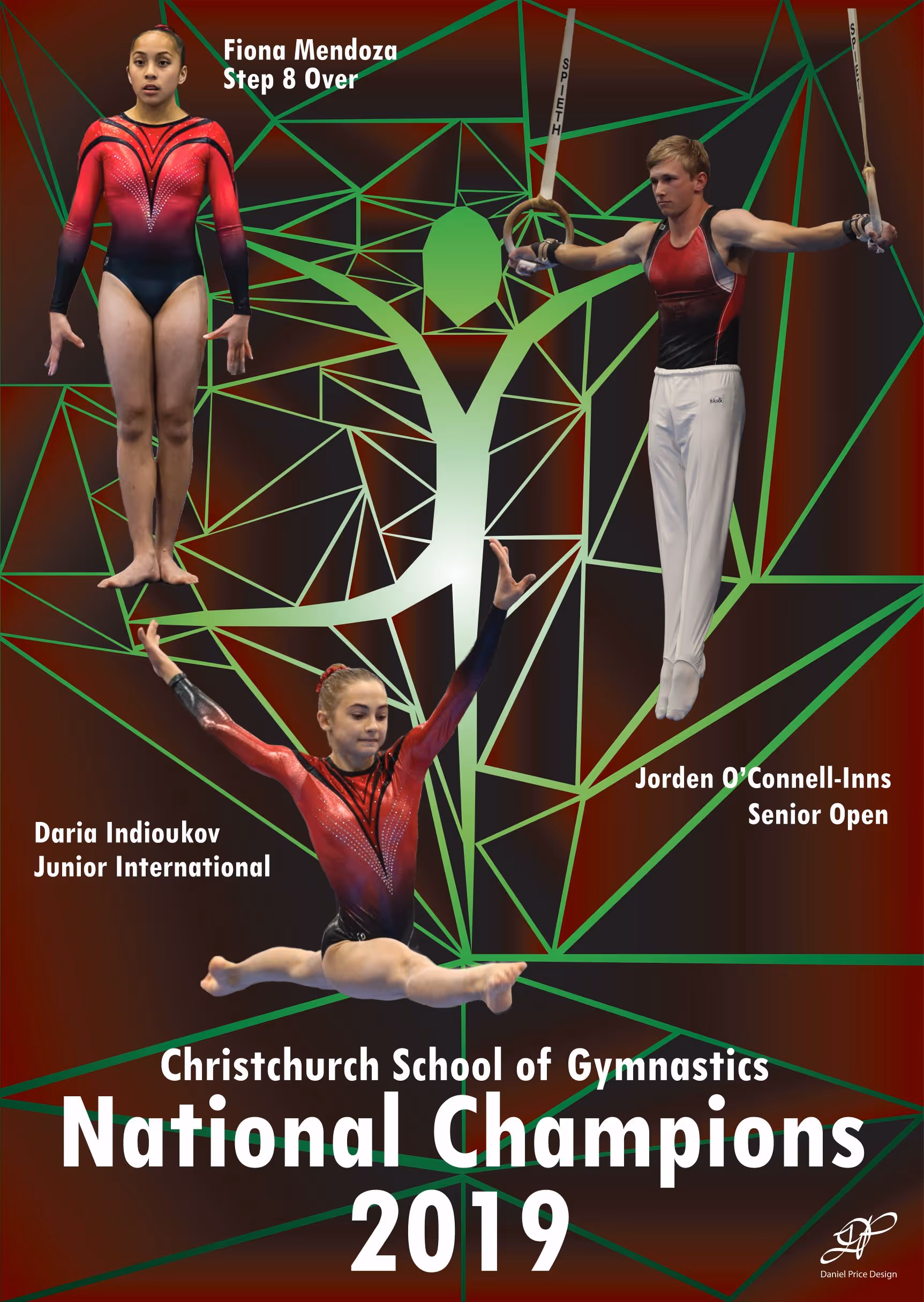
Christchurch School of Gymnastics
Comprehensive design solutions
Discover how we transform ideas into impactful visuals across diverse platforms, tailored to your unique needs
Art & Illustration
Adding unique artistic flair and bespoke visuals that elevate your message with originality.
Design for Branding
Forging distinct brand identities that resonate deeply and foster genuine recognition.
Design for Print
Crafting tangible materials that make a powerful, lasting impression in the physical world.
Design for Web
Building intuitive and captivating digital experiences that engage your online audience.
Let's Bring Your Vision to Life
Let's discuss how bespoke design and art can make your next project truly unforgettable and connect deeply with your audience.